Visuals
- Visual
Take the challenges to become part of a multi-disciplinary team dedicated to visualizing the results of complexity science research.
- Visual
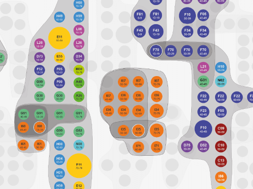
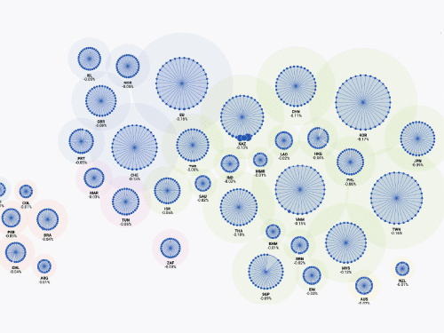
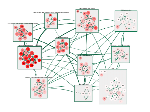
Explore the overlapping communities of diagnoses in the multilayer comorbidity network.
Visuals Team
Data visualization turns complexity into clarity, transforming raw data into vibrant images. Breathing life into data, these visualizations reveal patterns, untangle chaos, and empower a vivid understanding—an artistic translator that resonates beyond mere words and numbers.
Our visualization team, comprising Liuhuaying Yang and Tobias Batik, is dedicated to making vast datasets understandable to diverse audiences. Through interactive dashboards and visual stories, they encourage visitors to indulge their curiosity and delve into complex topics, ranging from dependencies within the global supply network to the mobility dynamics in cities across the globe.
Take the challenges to become part of a multi-disciplinary team dedicated to visualizing the results of complexity science research.
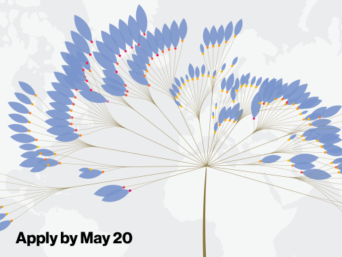
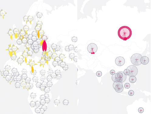
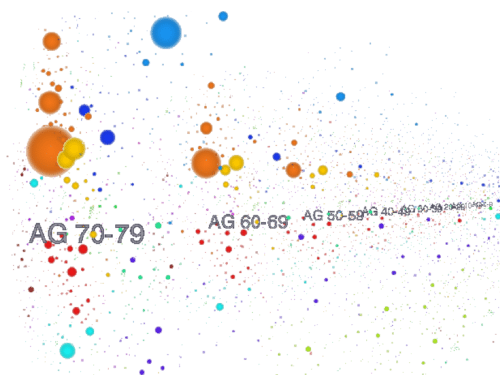
Explore patterns in the ability of institutions and countries to attract and retain research talent across disciplines.
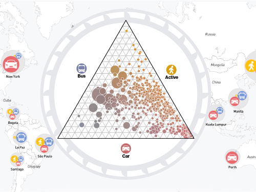
How do people travel to work in your city? Explore the model share data for over 800 cities in the world.
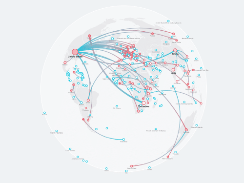
Which regions receive most attention from the Sustainable Development Goals (SDGs) research, and which regions are more studying others than self?
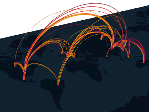
Explore effects of global supply disruptions via interactive visualizations and maps.
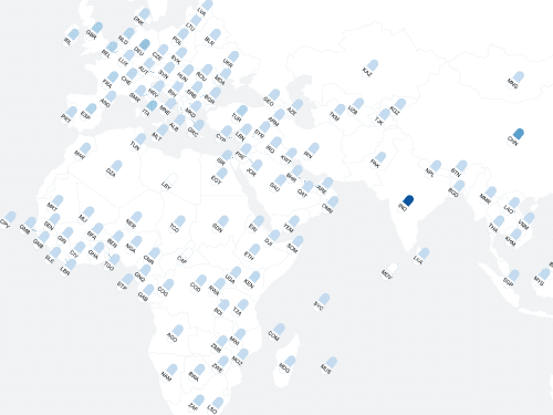
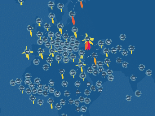
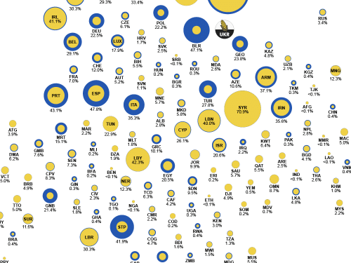
Explore how vulnerable the antibiotics supply in more than 100 countries is with respect to production disruptions in any of the other countries.
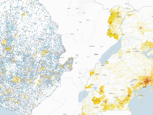
Explore the inferred wealth in Sierra Leone and Uganda from multiple machine learning models
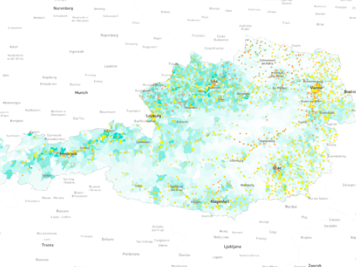
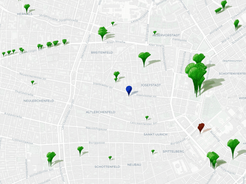
Explore the potential green products in Austria in product space.
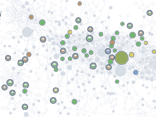
Explore the overlapping communities of diagnoses in the multilayer comorbidity network.
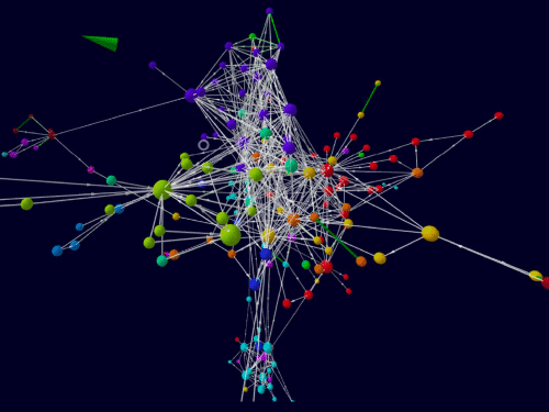
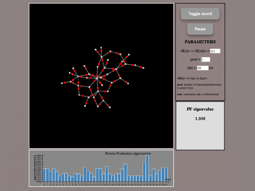
Explore how algorithms work on different types of networks, starting from explaning the essential components and leading to a more advanced explorable dashboard.
Explore which food products are lost and which countries are affected most severely when a specific supplier stops to produce a single food product.
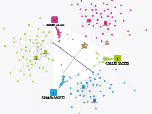
Learn intricate social polarization in multipolar systems through scrollytelling in digestible bits and explore advanced network models, including a real-world scenario with four poles (3D opinion space) of the Spanish General Elections of 2015.
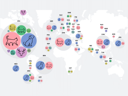
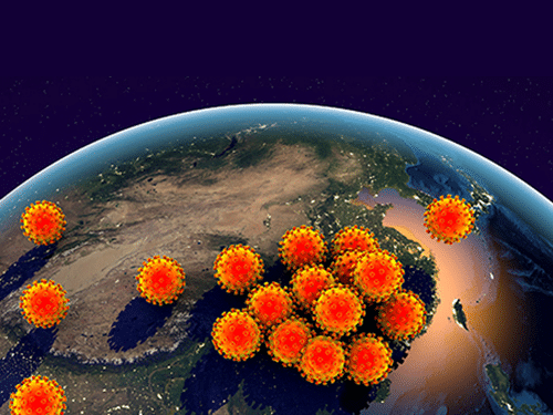
Get intuitive insights into specific aspects of SARS-CoV-2 events in animals at-a-glance.
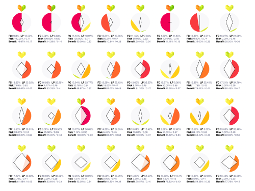
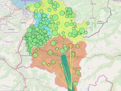
Explore the resilience of the Austrian healthcare system using agent based simulation
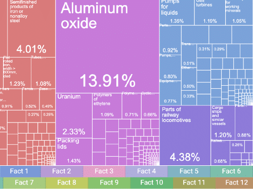
Twelve Facts about the Relation Between the Economies of Ukraine, Russia, and the EU
Explore the effects of international sanctions against Russia in response to the invasion of Ukraine.
Show direct and indirect effects of a 100% supply shock of maize and sunflower seed oil on a stylized world map.
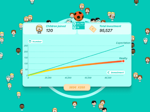
Play a game to learn some insights from the sport funding transparency research
Get an overview of Austrian sport clubs, how they are funded and how many children they train.
Upload your network data and explore your network in VR (or in the browser).
Explore which emotions emerge in Austria during the times of the corona crisis, in this monitor of social media platforms.
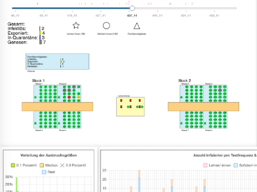
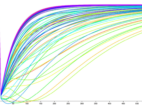
Explore the effect on COVID19 prevention measures on outbreak sizes in schools.
Find out which topics played an important role in the first months of the outbreak, which conspiracy theories emerged, and who spread them.
How does an economic shock to a specific sector in a country impact other sectors in other countries?
Largest dataset of governmental measures against the spreading of COVID-19 now freely available.
Explore the economic resilience of 65 Austrian economic sectors in this interactive model.
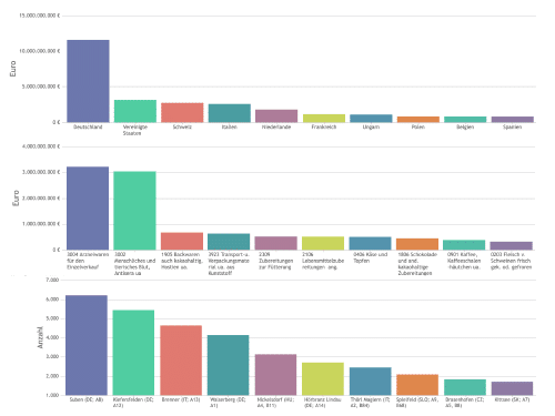
Find out what goods Austria imports and exports from/to which countries.
The number of tweets in different countries show expressions of concern, and anxiety but also pro-social behavior during the COVID19 crisis.
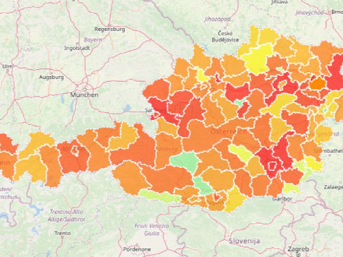
How resilient are the districts of Austria to a sudden decrease in health care practitioners?
Remove doctors from the health care system and observe how patients try to find a new practitioner as the load on the system grows.
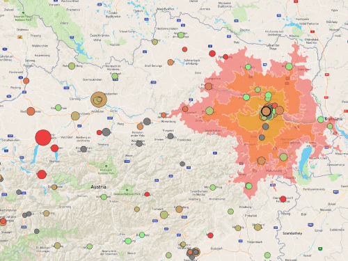
Explore the Austrian hospital landscape: learn about department types, patient load, and reachability of Austrian hospitals.
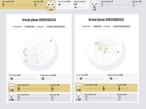
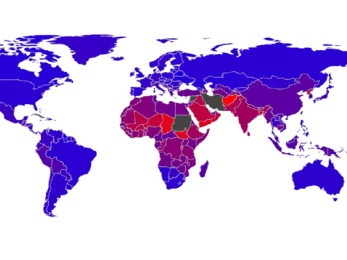
Find out how world-wide gender inequality is related to male/female facebook activity ratios.
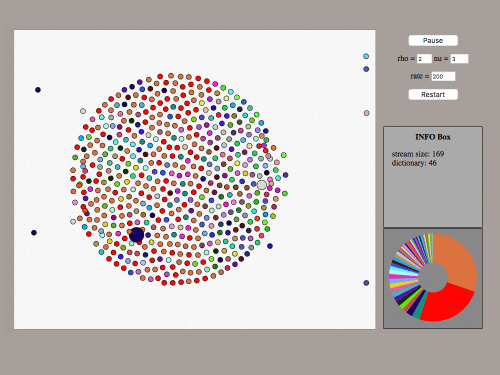
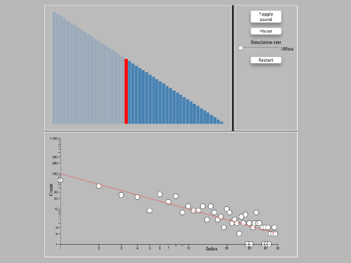
An audiovisual illustration of sample space reducing processes.
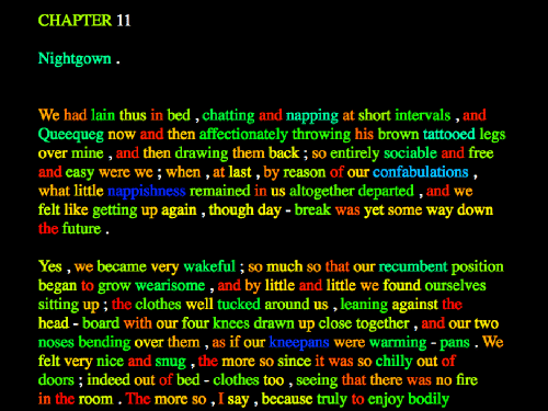
The visualization shows words in Moby Dick, colored by the grade of “surprise” their appearance causes, compared to the appearance of words in the whole Gutenberg corpus.


